White-Label Branding
An on-premise deployment can carry your own brand: your logo, your favicon, your application name and your colors, with a separate palette for light mode and dark mode. No custom image is needed. Everything on this page is configuration.
What can and cannot be branded
Branded: the application itself, including the menu, buttons, icons, page and card surfaces, text, borders, the credential card, the browser tab title and the favicon.
Not branded: the sign-in screen. It belongs to your identity provider, not to the Business Wallet, and carries its own theme. See Identity Provider for that configuration.
How it works
The backend serves your palette as a stylesheet at /public/branding.css, which the
application loads before it paints. Two rules follow from that:
- Anything you do not set keeps its default. The defaults are the Credenco palette and they live in the application itself, so an unconfigured deployment looks exactly as it does today, and a partly configured one mixes your colors with Credenco's defaults for whatever you left out.
- Dark mode falls back to light mode. A color set under
lightand not underdarkis used in both. Set adarkvalue only where the light one does not work on a dark surface, which is usually the case for a saturated brand color.
Settings
Non-color settings, which apply to both themes:
| Setting | What it does | If you leave it empty |
|---|---|---|
branding.logo-url | Your logo, shown in place of the Credenco wordmark under Powered by at the bottom of the menu, and at the top of the menu for any wallet that has no organization logo of its own. Must be an http or https URL your users can reach. | The Credenco logo is used. The same happens if the image fails to load. |
branding.favicon-url | The browser tab icon. | The Credenco favicon is used. |
branding.app-name | The product name in the browser tab title, for example "Contoso Business Wallet". | "Credenco Business Wallet" is used. |
branding.watermark | true or false. The decorative ring watermark at the bottom of the menu. | The watermark is shown. |
Colors, each available under both branding.light and branding.dark:
| Setting | What it colors | If you leave it empty |
|---|---|---|
primary | Links, focus outlines, the active menu item, and anything else that reads as "interactive". | The Credenco blue. |
button | The fill of primary buttons. Set this only if your buttons should differ from your links. | Falls back to primary. |
menu-background | The background of the left-hand menu. | The Credenco deep navy. |
menu-text | The text and icons in the menu. Resting items are rendered slightly softer than this color, blended toward the menu background. The active item's icon and the keyboard focus ring follow it as well, unless accent-color is set. | White. |
icon-background | The filled tile behind a page or card icon. | Falls back to primary. |
icon | The glyph drawn on that tile. Pick a color that is readable on your icon-background. | White. |
background | The page background behind the cards. | A very light grey. |
surface | Cards, dialogs and panels. | White. |
text | Headings and body text. Captions, help text and placeholders are derived from it, blended toward background, so they stay readable. | Near-black. |
border | Card borders and the dividers between rows. | A light grey. |
accent-color | Decorative accent: the underline on the active tab, the marker on a selected row, the active item in the menu, and the ring watermark when it is switched on. | A soft tint of primary, or the Credenco light blue when primary is unset too. |
card-gradient-start / card-gradient-end | The gradient on credential cards. | The Credenco navy gradient. |
Colors must be CSS hex values: #rgb, #rgba, #rrggbb or #rrggbbaa. Anything else
is ignored, logged as a warning, and the default is used for that one setting.
Several parts of the interface are derived from the settings above rather than configured separately, so that a short palette still produces a coherent result:
| Derived from | What it colors |
|---|---|
primary | Focus rings, the hover shade of buttons (darker in light mode, lighter in dark), the info banner, and the role pills on the API access screen. The text on those pills is picked as black or white, whichever reads on your color. |
text | Captions, help text and placeholders, blended toward background so they stay a step quieter than body text. |
icon-background | The soft tile behind dashboard and wizard icons. |
menu-text | The menu's resting items, the active item's icon and the keyboard focus ring inside the menu. |
Contrast is yours to get right. The application uses the colors you give it. It does
not adjust a hard-to-read combination and it does not refuse to start on one. Check your
text against your background, and your icon against your icon-background, before
rolling a palette out.
Example
This is a complete palette for an invented company, CoolSoft B.V. Two things to notice. dark only restates the colors that need to change: the teal is lightened so it holds up
on a dark surface and the neutrals are inverted, while icon-background carries over from
light untouched. And watermark: false turns off the decorative
rings at the bottom of the menu, which is the usual choice when the menu carries your own
brand color rather than Credenco's.
branding:
  logo-url: "https://example.com/logo.png"
  favicon-url: "https://example.com/favicon.ico"
  app-name: "CoolSoft Business Wallet"
  watermark: false
  light:
    primary: "#2f6f6a"
    button: "#2f6f6a"
    menu-background: "#1f2933"
    menu-text: "#ffffff"
    icon-background: "#ffd166"
    icon: "#1f2933"
    background: "#f4f6f7"
    surface: "#ffffff"
    text: "#16202b"
    border: "#dde3e7"
    card-gradient-start: "#1f2933"
    card-gradient-end: "#2f6f6a"
  dark:
    primary: "#6fbfb6"
    menu-background: "#141a21"
    menu-text: "#f2f5f7"
    icon: "#141a21"
    background: "#10161c"
    surface: "#18202a"
    text: "#eef3f6"
    border: "#27313c"
    card-gradient-start: "#141a21"
In Helm, the same values are set as environment variables on the backend chart, under
microservice.configMap.environmentVars:
organization-webwallet-backend:
  microservice:
    configMap:
      environmentVars:
        branding_logourl: "https://example.com/logo.png"
        branding_appname: "CoolSoft Business Wallet"
        branding_watermark: "false"
        branding_light_primary: "#2f6f6a"
        branding_light_menubackground: "#1f2933"
        branding_light_menutext: "#ffffff"
        branding_light_iconbackground: "#ffd166"
        branding_dark_primary: "#6fbfb6"
        branding_dark_background: "#10161c"
Watch the spelling of multi-word settings: menu-background becomes
branding_light_menubackground, with the hyphen removed rather than turned into an
underscore. Single-word settings such as primary and text are unaffected. The full
list of keys is in the chart values.
What it looks like
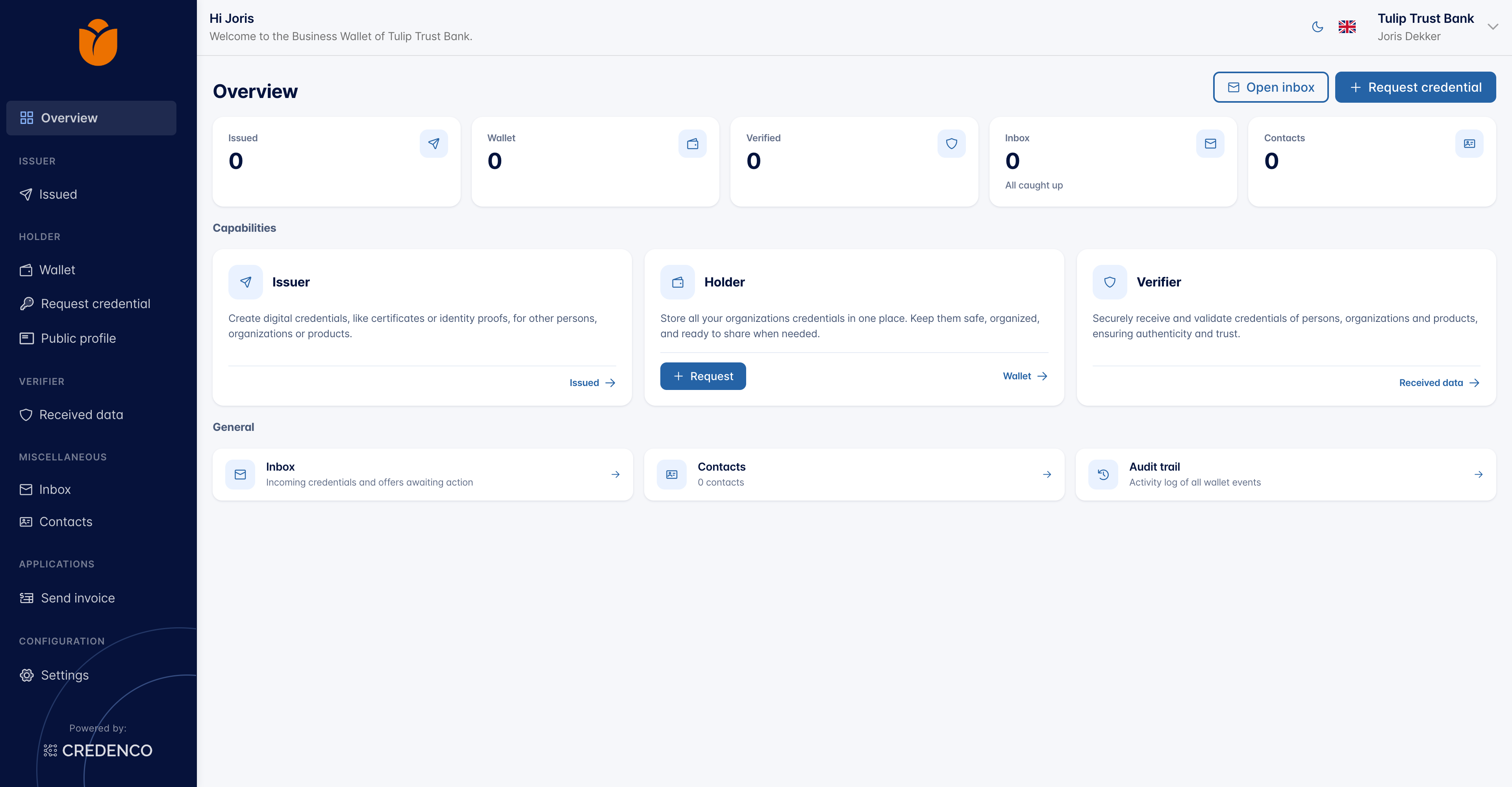
The default Credenco branding, with nothing configured. Note the ring watermark at the bottom of the menu:
The same screen with the example palette above, in light mode. The logo is left at its default here, since the example company does not have one. The numbers mark which setting colors which part of the screen:
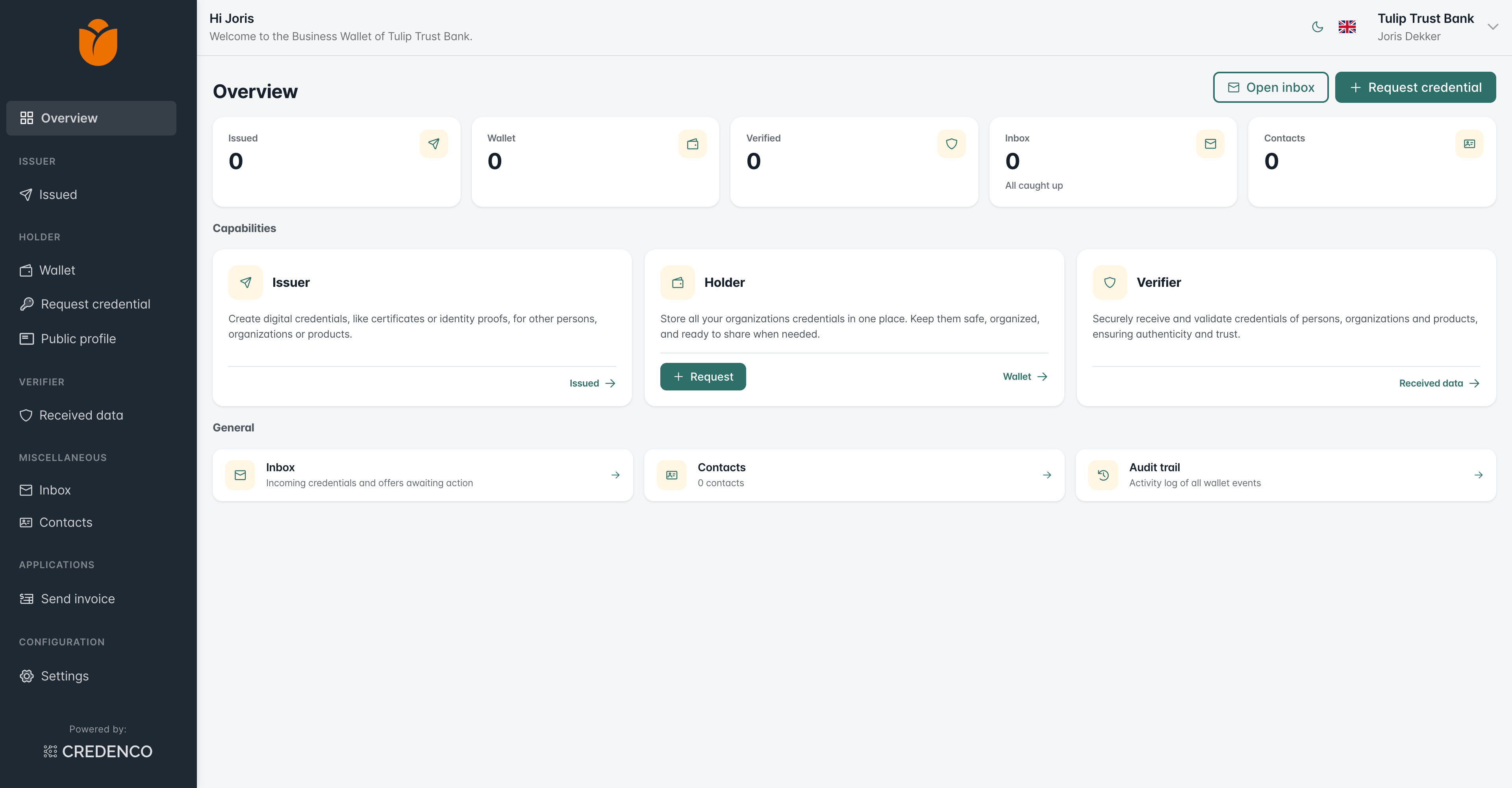 1234567891011
| # | Setting | Value | What it is on this screen |
|---|---|---|---|
| 1 | logo-url | Unset in this example | The logo under Powered by at the bottom of the menu. The logo at the top is the wallet's own organization logo; when a wallet has none, it falls back to logo-url as well. |
| 2 | menu-background | #1f2933 | The menu panel itself. |
| 3 | accent-color | Unset, so it follows menu-text | The highlight on the active menu item, Overview. |
| 4 | menu-text | #ffffff | The menu labels and their icons. Resting items are drawn slightly softer than the active one. |
| 5 | primary | #2f6f6a | Links such as Issued →, the outlined buttons at the top right, and focus outlines. |
| 6 | button | #2f6f6a | The fill of primary buttons, such as Request. Left unset, it follows primary. |
| 7 | text | #16202b | Headings and body text. The card descriptions are derived from it, a step quieter. |
| 8 | background | #f4f6f7 | The page behind the cards. |
| 9 | surface | #ffffff | The cards themselves. |
| 10 | border | #dde3e7 | Card borders and the dividers inside them. |
| 11 | icon-background / icon | #ffd166 / #1f2933 | The tile behind a card icon, and the glyph drawn on it. |
Not visible here: card-gradient-start / card-gradient-end, which color credential cards
in the wallet, and watermark / accent-color, which draw the ring at the bottom of the
menu when it is switched on.
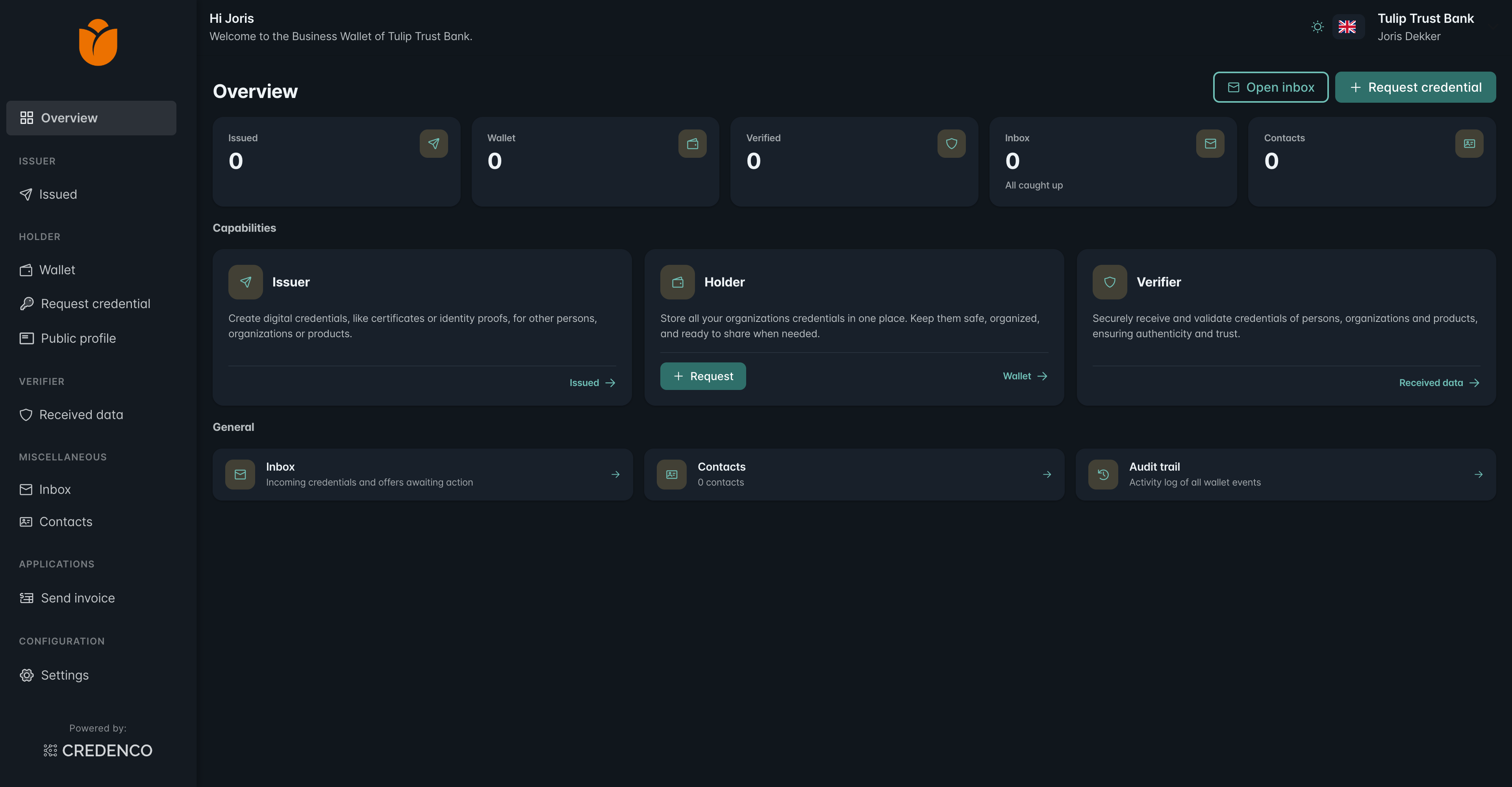
And in dark mode, where the lightened teal and the inverted neutrals take over. The same
amber icon-background is configured here, drawn softer against the dark surface:
Applying a change
Branding is read when the backend starts, so a change to these values takes effect after the backend restarts. Users may need to reload the page once, since the browser caches the stylesheet along with the rest of the application.